Screens
Screens are special maps that define the visible area of your game, i.e. your game UI.
Design screens with the same map tools you already use:
- Linedef / Edge Tool and Sector / Face Tool: carve areas, name sectors to turn them into widgets.
- Rect Tool: add background decorations.
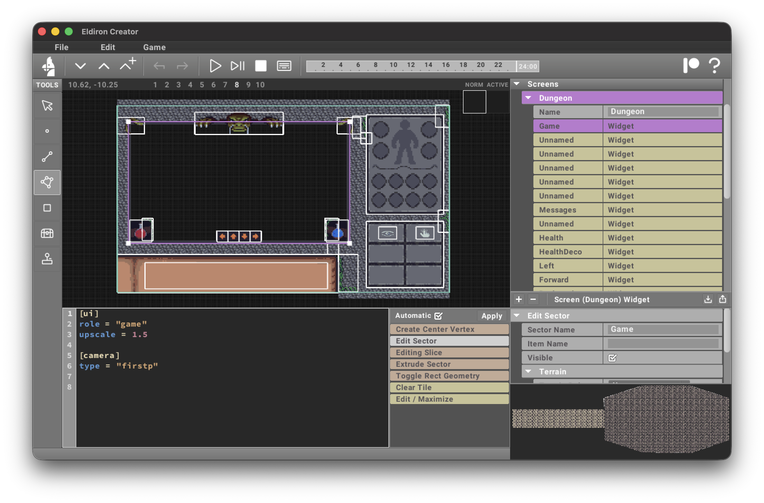
Each sector shows up as an item in the project tree; selecting it opens the widget editor where you can set the role and configure widget attributes (see widgets).
Screen Settings and Responsive Layout
Select Settings below a Screen in the project tree to edit its screen-level TOML. Screens use the legacy fixed canvas unless they explicitly enable responsive layout:
[layout]
mode = "responsive"
On a responsive screen, an existing role = "game" widget automatically fills the current client window. Widget roles are lowercase identifiers, so use role = "game", not role = "Game". Eldiron does not create a game widget automatically: a responsive screen without one is a valid UI-only screen.
For a ruleset-driven bottom UI, add one widget with role = "action_bar" and anchor it with anchor = "bottom_center". The widget generates its configured buttons as a group and keeps the complete bar centered when the window is resized. Its TOML can also configure built-in panels such as [ui.equipment], [ui.inventory], [ui.spellbook], and [ui.preferences], so an ordinary gameplay screen does not need separate popup widgets. Add a role = "equipment", role = "inventory", or role = "spellbook" sector only when that screen should override the corresponding default panel rectangle or presentation. See Action Bar Widgets.
Reusable role = "tab_bar" and role = "dropdown" widgets provide binding-driven selections for inventory filters, sorting, and custom panels. They use Eldiron's embedded Roboto Bold font by default and can select a project font explicitly. See Tab Bar and Dropdown Widgets.
Other widgets can anchor their authored size to the runtime window:
[layout]
anchor = "bottom_center"
x = 0
y = -20
Supported anchors are top_left, top_center, top_right, center_left, center, center_right, bottom_left, bottom_center, and bottom_right. The optional x and y values are offsets from the anchor. Without an anchor, the authored widget rectangle is retained.